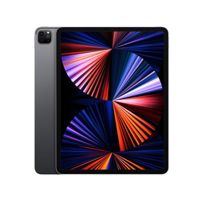
Apple Shopping Event
Hurry and get discounts on all Apple devices up to 20%
0
days
00
hr
00
min
00
sc
STM32 Minimumsystem Development Board
AED 28.57MEGA328 LILYPAD
AED 66.67SENSOR SHIELD V5
AED 14.29P1833 USB Micro-B Breakout Board
AED 23.81ATMEGA328 328p 5V 16MHz PRO-MINI MODULE
AED 61.90KK2.1.5 Multi-rotor LCD Flight Control Board
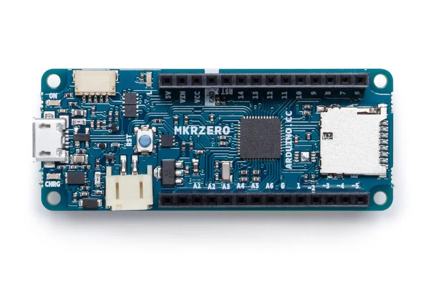
AED 171.43MKR PROTOSHIELD L
AED 42.86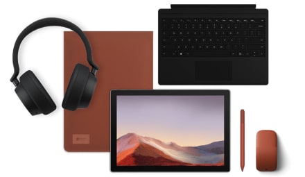
Microsoft Accessories
Personalize your Surface Pro with Microsoft branded accessories. In the presence of many colors for every taste.
Recently Viewed
Our Articles
Turning Your Old Raspberry Pi into an Ad Blocker: Say Goodbye to Onlline Ads
Turning Your Old Raspberry Pi into an Ad Blocker: Say Goodbye to Online Ads
Do you have an old Raspberry Pi...
Arduino vs. Raspberry Pi
DIFFERENCES
Arduino is a microcontroller motherboard. A microcontroller is a simple computer that...
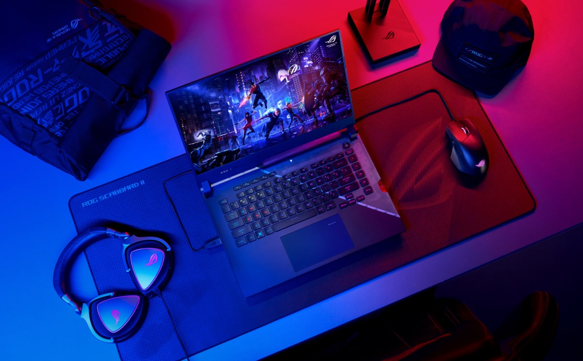
Best Gaming Laptop Models
At solmen va esser necessi far uniform grammatica, pronunciation e plu sommun paroles…
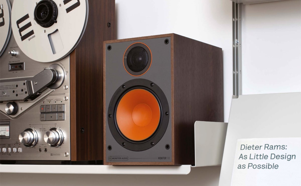
How to choose a HI-FI stereo system
Nullam dictum felis eu pede mollis pretium. Integer tincidunt. Cras dapibus. Vivamus elementum semper nisi…
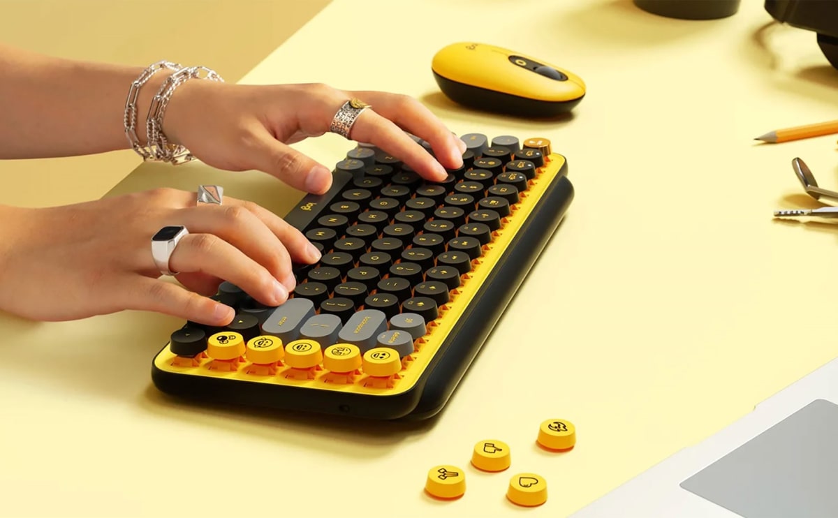
Logitech POP Keys
Maecenas nec odio et ante tincidunt tempus. Donec vitae sapien ut libero venenatis faucibus. Nullam quis ante. Etiam sit amet orci…
Online store of household appliances and electronics
Then the question arises: where’s the content? Not there yet? That’s not so bad, there’s dummy copy to the rescue. But worse, what if the fish doesn’t fit in the can, the foot’s to big for the boot? Or to small? To short sentences, to many headings, images too large for the proposed design, or too small, or they fit in but it looks iffy for reasons.
A client that’s unhappy for a reason is a problem, a client that’s unhappy though he or her can’t quite put a finger on it is worse. Chances are there wasn’t collaboration, communication, and checkpoints, there wasn’t a process agreed upon or specified with the granularity required. It’s content strategy gone awry right from the start. If that’s what you think how bout the other way around? How can you evaluate content without design? No typography, no colors, no layout, no styles, all those things that convey the important signals that go beyond the mere textual, hierarchies of information, weight, emphasis, oblique stresses, priorities, all those subtle cues that also have visual and emotional appeal to the reader.
